How to Create a Calm Digital Space: Simple Design Choices That Reduce Visual Stress

We spend more time in digital spaces than ever before—scrolling, working, creating, and relaxing through our screens. Yet many of us don’t realize how much our digital environment affects our mood, focus, and overall sense of calm.
A cluttered, visually busy screen can quietly increase stress, while a thoughtfully designed digital space can feel grounding and supportive. Creating a calm digital space doesn’t require expensive tools or drastic changes—just a few intentional design choices.
Here’s how to create a digital environment that feels peaceful, balanced, and easy to live with.
What Is Visual Stress (and Why It Matters)?
Visual stress happens when the eyes and brain are overloaded with too much information at once—bright colors, cluttered layouts, busy imagery, or constant contrast. Over time, this can lead to mental fatigue, difficulty focusing, and a feeling of being “on edge,” even when you’re doing something simple like checking your phone.
Because we look at our screens dozens—or even hundreds—of times a day, small design decisions can have a big impact.
A calm digital space helps:
- Reduce overstimulation
- Improve focus and clarity
- Support a more relaxed mindset
- Make everyday screen use feel lighter and more enjoyable
Start With a Soft, Supportive Color Palette

Color is one of the most powerful tools in digital design.
Soft neutrals—such as warm beige, muted blush, gentle gray, sage, and off-white—are naturally calming because they mimic tones found in nature. These colors don’t compete for attention, allowing the eyes to rest.
If you enjoy brighter colors, they can still be included—but in moderation. A neutral base with subtle accents feels far calmer than a screen filled edge-to-edge with bold hues.
Tip: Choose wallpapers and backgrounds with:
- Low contrast
- Soft lighting
- Muted or harmonious colors
Simplify Your Backgrounds
Busy photos, harsh patterns, or high-contrast images can feel exciting at first but often become visually exhausting over time.
Calm digital backgrounds tend to share a few traits:
- Open space or gentle gradients
- Soft textures
- Minimal focal points
- Natural elements like light, florals, or landscapes
Your background should support what you do on your screen—not fight for attention.
Reduce Digital Clutter Where You Can
Visual clutter doesn’t just exist in physical spaces—it shows up digitally too.
A few small changes can make a big difference:
- Remove apps you don’t use regularly
- Group similar apps into folders
- Limit the number of widgets on your home screen
- Keep only what you actually need visible
The goal isn’t perfection—it’s ease. When your screen feels organized, your mind often follows.
Choose Gentle Layouts and Spacing
Spacing is an often-overlooked element of calm design.
Screens that feel cramped or overcrowded can create subtle tension. Leaving space between icons, widgets, or elements allows the eyes to move naturally and comfortably.
If possible:
- Avoid stacking too many elements in one area
- Use layouts that feel balanced rather than packed
- Let empty space exist—it’s part of the design
Whitespace isn’t wasted space; it’s breathing room.
Match Your Digital Space to Your Lifestyle
A calm digital space should reflect how you live, not just how it looks.
Ask yourself:
- Do I want my phone to feel relaxing or energizing?
- Do I check my screen often throughout the day?
- Do I use my device mostly for work, creativity, or downtime?
Someone who uses their phone for focus may prefer softer, simpler visuals. Someone who uses it for inspiration may enjoy gentle color accents or seasonal imagery. There’s no one “right” look—only what feels supportive to you.
Let Seasons Influence Your Screens

Just like home decor, digital spaces can benefit from seasonal shifts.
Many people naturally crave:
- Softer, lighter tones in spring
- Airy, fresh colors in summer
- Cozy, muted palettes in fall
- Calm neutrals and gentle contrast in winter
Updating your digital space with the seasons can make it feel refreshed without being overwhelming.
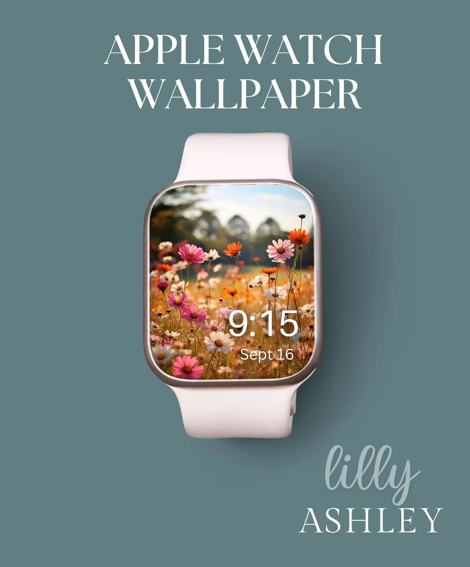
Keep Consistency Across Your Screens
Consistency creates calm.
When your phone wallpaper, desktop background, and even watch face share a similar tone or color palette, everything feels more intentional. This doesn’t mean everything must match exactly—just that the overall mood feels cohesive.
A connected digital aesthetic reduces visual “noise” and creates a smoother experience throughout your day.
Focus on How Your Screen Feels, Not Just How It Looks
The most important question to ask isn’t “Is this trendy?”
It’s “How does this make me feel?”
If your screen feels:
- Relaxing when you unlock it
- Easy to navigate
- Visually gentle
- Supportive of your daily routines
…then you’re doing it right.
Final Thoughts: Calm Is a Choice You Can Design
A calm digital space isn’t about removing personality or creativity—it’s about creating an environment that works with you, not against you. Through thoughtful color choices, simplified layouts, and intentional design, your screens can become a quiet, supportive part of your day instead of a source of visual stress.
Small changes add up. And sometimes, the calmest spaces are the ones designed with the most care.

ICYMI: