How Color Affects Mood: Using Soft Neutrals vs Bright Accents

Color quietly shapes how we feel—often without us even realizing it. From the calm you feel in a softly lit room to the energy sparked by a bold pop of color, design choices play a powerful role in our mood, focus, and sense of well-being. Whether you’re decorating your home, choosing a phone wallpaper, or curating a creative workspace, understanding how color affects mood can help you create spaces that truly support how you want to feel.
In this post, we’ll explore the emotional impact of soft neutral colors versus bright accent colors, how each influences mood, and how to use both intentionally for a balanced, uplifting aesthetic.
Why Color Has Such a Strong Emotional Impact
Color psychology is the study of how different hues influence human behavior and emotions. Our brains respond to color almost instantly, forming associations based on nature, culture, memory, and personal experience.
For example:
- Soft, muted tones often feel calming and safe because they resemble natural environments like sand, clouds, or early morning light.
- Bright colors feel energizing and stimulating, similar to flowers in bloom, sunshine, or festive spaces.
Neither is “better”—they simply serve different emotional purposes.
The Power of Soft Neutral Colors

Soft neutrals include shades like warm beige, cream, soft gray, blush, pale taupe, muted sage, and gentle off-whites. These colors are often described as timeless, peaceful, and grounding.
Emotional Effects of Soft Neutrals
Soft neutrals tend to:
- Reduce visual stress
- Promote relaxation and calm
- Create a sense of openness and clarity
- Support focus and mindfulness
Because they don’t demand attention, neutral tones allow the mind to rest. This is why they’re commonly used in spas, minimalist interiors, and serene digital designs.
Where Soft Neutrals Shine
Soft neutrals work beautifully in:
- Bedrooms and cozy living spaces
- Home offices where focus matters
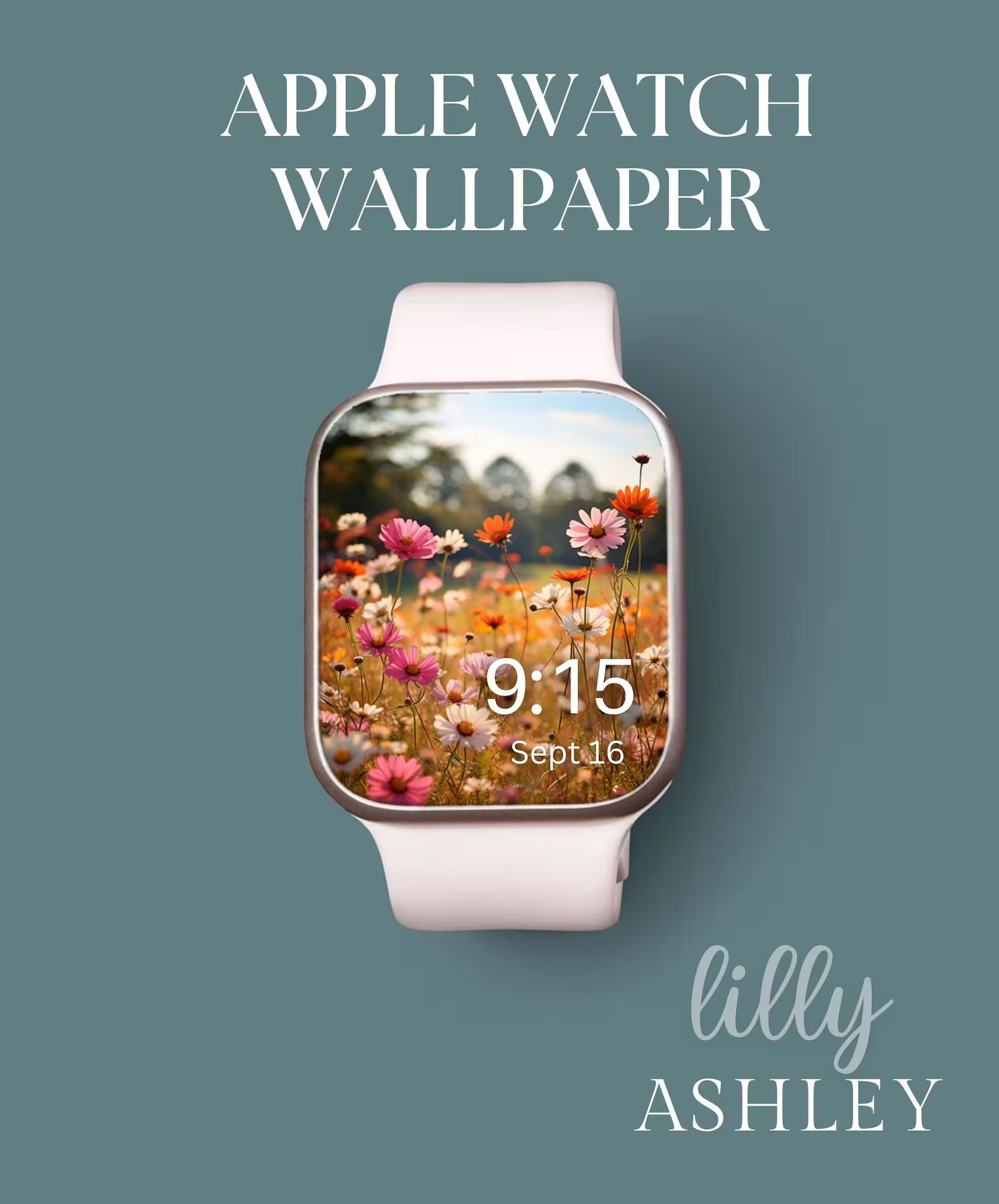
- Phone wallpapers meant to feel calming
- Digital backgrounds used daily
They’re especially helpful if you feel overstimulated or overwhelmed—neutral palettes create visual breathing room.
The Energy of Bright Accent Colors

Bright accent colors include hues like coral, sunny yellow, vibrant pink, turquoise, cobalt blue, emerald green, and bold floral tones. These colors bring life, personality, and movement into a design.
Emotional Effects of Bright Colors
Bright accents can:
- Boost energy and motivation
- Spark creativity and joy
- Add personality and playfulness
- Draw attention and create excitement
These colors work best when used intentionally, rather than everywhere at once.
Why Accents Matter
Too many bright colors can feel chaotic, but well-placed accents create balance. Think of a neutral room with a vase of colorful wildflowers, or a soft phone wallpaper with a single pop of warm sunlight.
Accents give the eye a place to land.
Soft Neutrals vs Bright Accents: Finding the Balance
The most emotionally satisfying designs often combine both.
A Helpful Rule of Thumb
- 80–90% soft neutrals for calm and cohesion
- 10–20% bright accents for interest and joy
This balance keeps a design from feeling flat while avoiding visual overload.
Examples of Balanced Use
- A soft beige wallpaper with gentle golden light
- Neutral backgrounds with subtle floral color
- Minimalist spaces accented with seasonal color
- Calm phone screens with one focal point of brightness
The result feels intentional, not overwhelming.
How Color Choices Affect Your Digital Space
We interact with our phones more than almost any other object. The colors on your screen influence your mood dozens—sometimes hundreds—of times per day.
Choosing a Wallpaper That Supports Your Mood
Ask yourself:
- Do I want my phone to feel calming or energizing?
- Do I feel overwhelmed easily by visual clutter?
- Do I want a seasonal refresh without drastic change?
Soft neutrals are ideal if you want your phone to feel peaceful and grounding. Bright accents are perfect if you want a spark of joy or creativity—especially when layered gently into a neutral design.
Seasonal Shifts and Color Psychology
As seasons change, our color preferences often shift too.
Winter & Early Spring
- Soft neutrals feel comforting and hopeful
- Gentle florals and muted light ease the transition
- Pale colors reflect longer daylight and renewal
Late Spring & Summer
- Brighter accents feel energizing and celebratory
- Color feels lighter, fresher, and more playful
Listening to seasonal shifts helps your designs feel aligned with your natural rhythms.
Using Color Intentionally (Without Overthinking It)
You don’t need to follow rigid rules to benefit from color psychology. A few thoughtful choices go a long way.
Simple Tips
- Start with a neutral base you love
- Add one or two accent colors that make you happy
- Step back and notice how the space feels
- Adjust if it feels too busy or too flat
Design should support your life—not complicate it.
Creating a Cohesive Aesthetic Across Your Life
One of the most calming design approaches is visual consistency. When your digital space, home decor, and creative tools share a similar color language, everything feels more intentional.
This doesn’t mean everything must match—it simply means your choices feel connected.
Soft neutrals anchor your space. Bright accents bring it to life.
Final Thoughts: Let Color Work For You
Color isn’t just decoration—it’s a quiet form of communication between your environment and your emotions. By understanding how soft neutrals calm the mind and how bright accents energize the spirit, you can create spaces that feel supportive, inspiring, and beautifully balanced.
Whether you’re refreshing your phone, redesigning a room, or simply craving a sense of calm as the seasons change, intentional color choices can make everyday moments feel just a little more peaceful.
And sometimes, that’s exactly what we need. 🌿